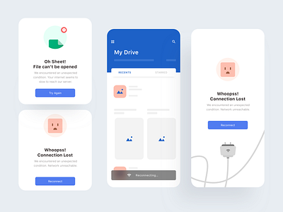
Heuristics Rule Number 9 - Drive
Heuristics Rule Number 9
“Help users recognize, diagnose, and recover from errors”
----------------------------------------------------
Error messages should be expressed in plain language (no codes), precisely indicate the problem, and constructively suggest a solution.
In other words the interface design should help the users to identify what is the exact error and suggest a way to get rid of that. If the user is not getting a helping hand on an error, they will definitely move away from the product.
When conducting a Heuristic Evaluation on interface design that is intended to find usability problems at heuristic point number 9, Help users recognize, diagnose, and recover from errors I usually make a question like the following:
1.Is the user being presented with an error message (no message) compilation adding wrong information in the form or in the dialogue?
2.Are users given human-readable error messages that offer useful information about how to correct problems?
3.Are users given an error message that doesn't blame the user for the error?
Feel free for leaving your comments, constructive feedback is welcome. 🙏
Don't forget to share some ♥️ with this design
Never end to practice, learn and explore.


