Icons For a Healthcare Web
Hi Dribbblers!
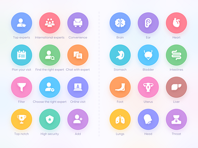
I am glad to share with you my recent icons design I did for my client, Which is a series of matching icons I designed for a healthcare web. The icon consists of two parts, the left part is the related content matching icon on the homepage of the website. The right part is the icon of the vital organs of the human body, which is the field served by this healthcare company.
Design Concept:
This set of icons consists of two parts, the background color part and the middle graphic part. I use a three-dimensional design method to make the middle graphic part more prominent.
Of course, I also tried another scheme. The background is white and the graphic part in the middle uses different colors. My client are very satisfied with both schemes.
Which solution do you like?
Looking forward to your feedback!
Need my design service?
I am Available for hire,
Email me 17723309147@163.com

