Daily UI :: 002 - Credit Card Checkout
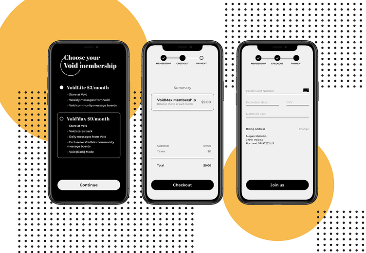
Using 100% black and white was a little too jarring, so to help reduce the contrast just a tad, I'm using a super light grey.
After going through these screens, I realized that the middle screen is redundant - you can only choose one membership option, so it's not like you can stack your cart, but here we are. I'll be adding a "confirmation" screen, outside of the challenge.
Again, any feedback is appreciated!
⚫️
