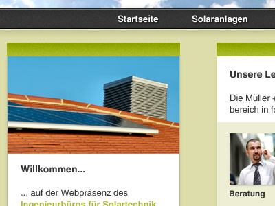
Ingenieurbüro für Solartechnik — content box & main navigation
This is a piece of my work for a studies project called »Ingenieurbüro für Solartechnik Müller + Schulz GmbH«. It will be a website for a solar energy company in German. What do you think?
Is this the right colour scheme for a solar company? It has to say "I am serious and I work with energy (renewable = olive?)".
More by Katharina Hermann View profile
Like
