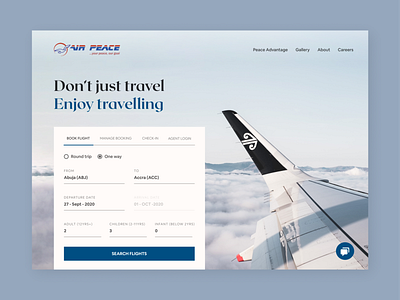
Air Peace Concept
So I was experiencing a block the other day with a project, to take my mind off it a bit I decided to read a blog post I opened earlier on Muzli, feel free to read it too
I saw the air travel site shot and immediately liked it, and it inspired me to do something for a local air travel company here in Nigeria. I went to their current website and saw it wasn't exactly a very good one
Things I spotted and solved are these:
- Too many distractions from the main reason most users visit, which is to book flights. For even an average user this will overwhelm their eyes, and for someone with an eye for clean design, it's a push away
- Poor use of color
- The flight booking form itself was not exactly pleasing to look at. It is functional, but not delightful to use
- The intercom was not clearly visible, so itching users may even miss using it, this could very much affect conversion
Visit their website
https://lnkd.in/deNSJTY
What are your thoughts about this?
