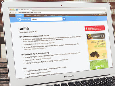
dictionary.com Redesign
Recently my son had to do a project for school. It involved looking up a word on dictionary.com. He first started reading through the ad words before figuring out where the appropriate information was. (Check out the before and after to see what I’m talking about)
I realize they have bills to pay, but I still feel that they could do a better job of displayed the content in a more user friendly manner.
I redesigned a typical results page. The big difference is that the content is larger and cleaner to read. All the ads are clustered on the right. The color from the ads and the tooltip prompting for the Premium version naturally draw your attention so I still feel like advertisers would be happy with this layout. Plus there is more space for ads.
Note: No offense to the designers of Dictionary.com, I know first hand how your designs can get messed up “along the way”.
Thank you @Zan for the product shot.


