Food Delivery App UI/UX Design
The team is available for new projects! Drop us a line: hello@purrweb.com | WhatsApp | Website
How are you doing, fam? Please, welcome our recent attempt to design a food delivery app!
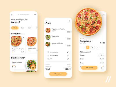
🍱 The home screen includes a category unit that helps to sort available meals. A meal card contains all information: price, rate, meal category. Plus, here users can choose a meal’s size, add any extra, and bookmark meals and business lunches.
🛒 In the upper-left corner of the screen, it’s a search by meals; in the bottom half, it’s fast access to a cart. Users add meals to the cart where they can see prices, find out ingredients. Once all meals are added to the cart, the user starts filling in the address, time, and chooses the payment method.
🌮 The core colors are black and yellow. Yellow is always associated with optimism and energy — it lets the user understand food will be delivered on time. We chose black as the opposite color that emphasizes the most important elements.
🤙🏻 The main advantages of the app are convenient navigation, fast access to features, and fast delivery!
Created by Polina Tolmacheva
Press L if you like this design and share feedback!
PS We know to utilize UI/UX design to make users fall in love with a product. Check out how we used our skills to:
- raise $400k as capital for startup
- streamline cryptocurrency e-wallet
- reboot a Real Estate startup
- help newbies jump into investing
- conquer the chef freelance market
- simplify the life of event organizers
And that's not all — you can find more case studies in our Blog! 💜


