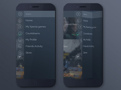
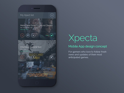
Xpecta App concept Folded Menu
I love the folded menu the moment I saw it and I think it would fit like a glove to this gamer's heaven app :) The icons of the menu's items are sliding from right to left to give it a touch of "glass" UX emphasizing the menu but still not making the icons take over. Instead the text takes over and focuses a user to a specific interaction.
Finally the active selection is going to have a bright and distinctive green with drop down option for more details. More of that in the next shot :)
More by Igor Jimi Ivankovic View profile
Like


