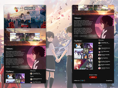
Hello World Concept Site (5 Month Retrospective Remaster)
Hey Dribbblers!
I recently revisited my very first "complete" design, which was a concept site for the anime movie "Hello World"! The full original can be found here, and you can also view the case study here!
For the newly revised concept site, I aimed to incorporate more thoughtful decisions to make the site more immersive: the purpose of a movie's website is, essentially, a huge advertisement. Here's a short list of what I changed:
- The tagline was broken into two and given a slight gradient to give a sense that the two main characters depicted are talking to each other. It can be read either as "I'll find my way back to you, even if the world breaks" or as "Even if the world breaks, I'll find my way back to you"--a reference to how manga and Japanese text is read from right to left.
- The trailer thumbnails both feature characters that are looking straight at the visitor.
- The about section features a character looking contemplatively at the text.
- The gallery is structured like a manga page, while the director and cast are listed in a traditional credits-esque fashion.
- There are redundant CTA's for streaming the movie on Netflix: once at the top, and again at the bottom of the webpage.
What do you guys think of it? Did I improve my design skills/thinking over the last 5 months? Let me know in the comments below, and if you liked it, be sure to hit that "L"!
Want to collaborate or hire me? Contact me at theo.oing@gmail.com!
