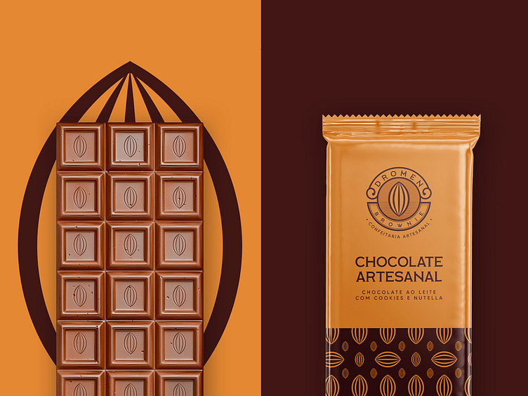
Dromen Brownie - Chocolate Packaging
Dromen Brownie is an artisanal bakeshop, specialized in brownies and cakes. It started with a couple’s dream, wishing to work with what they loved the most. This is why they choose this name for the brand, which means Dream in dutch.
The quality of their products is what they value the most, and this is a non-negotiable standard for their production. With that in mind, I choose the cocoa symbol to convey such an important value into the logo, in addition to a classic look and feel, the cocoa is a clear association with excellence and quality in products that utilize the chocolate as the main ingredient.
The brand was also built aiming a new target audience, that values quality and premium experiences above the price of the product.
More by Caio Duarte View profile
Like
