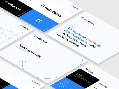
Brand Style Guide | Webstacks
Dribbble!
We've joined the party. For our first post, we're excited to share our brand style guide.
Here at Webstacks, our visual style reflects one of our main ideologies: simplicity reimagined.
We value minimalist design through whitespace and the classic "less is more". Though, we also bring boldness and flair with our colors, voice, and typography (where are our Supreme fans at?)
We hope you'll follow our journey, as we bring brands into the 21st century—one website at a time.
Let's go.
-The Webstacks Team
More by Webstacks View profile
Like


