Logo Concept for Home Furnishing Company called Bubbly Neat
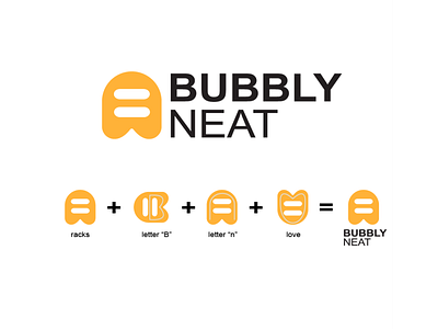
So, the idea is a logo that consists of 4 parts. Every part has its own meaning.
The first picture is a logo of a rack. This is what the company sells.
The second one is the word “B”, initial of Bubbly, and the third is letter “n” for neat.
And the last is the logo of love, it represents happiness, full of life home,
can also be neat, clean and well organized.
The color orange represents happiness, cheerful, and future.
I keep it as simple as possible so that it's easy to recognize, and easy to remember.
If you have any suggestion, comment down below, i'll be glad to hear it from you :))
