Travel App UI/UX Design
The team is available for new projects! Drop us a line: hello@purrweb.com | WhatsApp | Website
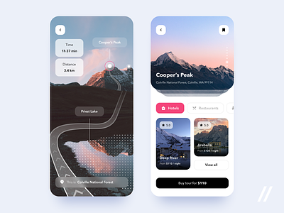
How's it going, friends? We’ve got a new shot: a design for a travel app that allows users to buy travel packages, book hotel rooms, check available spots to eat, and find the best attractions! 😻
⛰The left screen works like a guide to a museum: it takes the tourist who bought a tour over the place. For example, if the user buys a tour that includes an outing at the top of a mountain, he/she can open the in-app cam and track an arranged itinerary. The app will show all landmarks the user may face during the walk, estimate the time needed to complete the route, and the distance.
🚶🏻♂️The right one is a touring screen where users can bookmark tours, go through pics and hotels, restaurants, and entertainments nearby.
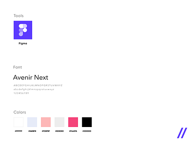
❤️ We are not scared of breaking the rules! Do not veto the combination of dark and reddish colors — it can be pretty good sometimes.
📲The neuronet of the app makes sure the user won’t miss anything must-see.
Created by Julia Tikhiy-Tishchenko
Feedback helps us improve and grow,
We’re keen to hear your thoughts!
We share experience in designing interfaces for healthcare startups 🏥, give insights into developing an app for pet owners 🐈, and reveal the secrets of coming up with a competitor to famous services 🤩
Keep in touch and check out our recent news 💜


