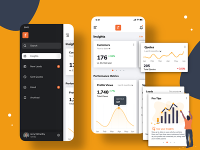
Side Project — Marketplace for Local Professionals III
Hey folks,
Excited to share the mobile version of the dashboard concept I've been working on lately for an online marketplace for local professionals. What do you think about the navigation design pattern? I think the search bar is not easily discoverable by users that come to the app expecting the search bar to be more prominently displayed, or at least hinted in the screen with a search icon. This design requires users to open the hamburger menu to reveal the search bar.
I love solving design problems and dilemmas like this. User testing is key to ensuring that we're building products and services that solve problems for real users. Let me know your thoughts in the comments.
Would love to hear what you think.
More by Julio Reguero View profile
Like
