SummitPost Redesign - Route
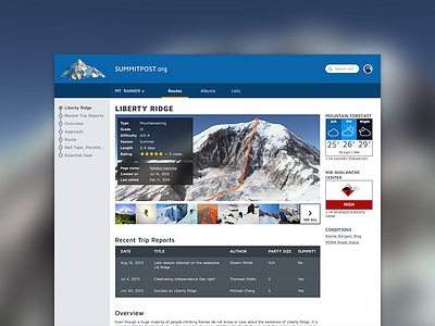
Conceptual redesign of a trip-finder website. This is the route page.
If you're familiar with climbing, feel free to comment on the UX.
Here are my UI concerns:
> Looking for a better way to display thumbnails
> Given the style of the header (very flat, clean), I want to pick a button style to match. Right now, the "SEE ALL" [photos] button is a square, 2px flat button, presumably with a hover state. But that style doesn't look great if there are a lot of interface elements on a page, so I'm not sure where to go with that so that all the buttons match.
> Dark background for the table or no?
> The right column looks cluttered. I think part of it is the two "modules" ("Mountain Forecast" and "NW Avalanche Center", which would be imported data from other sites in modular form) have 1px borders. That's the only place I have a solid 1px line. Not sure where to go with these. Note: the grouping of forecast, avy forecast, and conditions links is important-- those are all the things necessary to look at if you're planning a trip in the immediate future.
And apologies for not having a pro account-- hopefully it's still clear enough to be useful.
Thanks, friends!
