Logo Design For Zibaclick Website
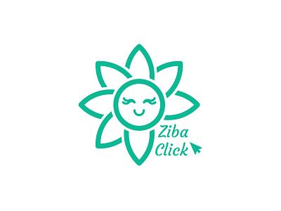
Zibaclick is a Startup which works in beauty field. As this Startup wants to be a comprehensive reference in beauty of whole parts of body I used Lotus flower because it is a symbol of beauty and also because of the circular nature of the flower and philosophy of circle shape (referring to be comprehensive) I selected this symbol for the logo of this brand.
As you see one petal is missing. Tagline of the brand is : One click to beauty. So I placed the click element and the name of business in the place of that missing petal. The meaning behind this part of the logo is that person before clicking on the link of the website of Zibaclick is not beautiful (missing petal = NOT being beautiful) And just after clicking he/she will be beautiful. (The petals will begin to grow)
For emphasizing on beauty of human I designed a face with eyelashes (it is also a symbol of beauty). And a smile is designed for showing the feeling of being beautiful.
-Now let me know what's your opinion about this project?
-If you would like to order you can get in touch with me by:
E-mail: logohamid98@gmail.com
You can also see the complete project on my behance: https://www.behance.net/gallery/104311581/ZibaClick-Website-Logo?share=1