ooomf — Footer
While working on a few new marketing pages, I decided to begin overhauling our marketing UI/brand.
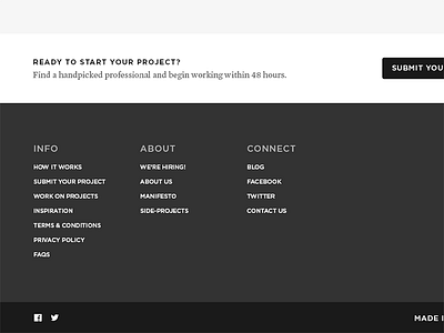
This is a snapshot of part of the marketing footer, which follows a similar style to the new marketing elements.
The main word we keep coming back to describe how we want ooomf to feel is 'human'. We're also going for 'hand-crafted', 'quality', and 'curated', so we're moving away from the 'fun' feel we have right now. We also need to be able to showcase a lot of different types of content and styles, so the marketing UI needs to work well with multiple different styles (hence why there won't be as many colours).
We're going to be unveling some rebrand stuff in the near future, so look out for more of it soon.