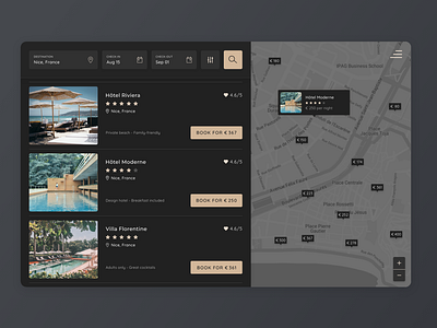
Dark Mode Hotel Booking Map UI
I wanted to take a stab at a dark themed design! This is a version of a hotel search design I posted last week, that I translated into dark mode.
A realization about dark mode is that shadows have to be treated differently (of course when you think about it haha)... This implementation is a bit more flat than the other one! How do you work with shadows on dark mode? Or do you just keep the design flat? Looking forward to your feedback and maybe if you are able to share helpful resources about building dark ui! :)
More by Sara Isotalo View profile
Like
