Yapster Redesign

I once used had to use an app called Yapster at my old job for team communication. I Scrolled through comments on the Play and app store to see what issues users were having.
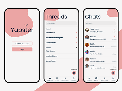
Users posted it needs a new UI, it is slow and buggy, and they need a way to post a PDF. I made sure to update the UI, and include a way to post PDF's. However, my main goal was to give the UI a fresh take. I didn't use the original orange because it is too saturated and hard to find a contrasting colour. The logo is updated to a clean and simple bird illustration to give the app a social feeling and the overall UI looks less clunky, more clean and modern.
I took inspiration from slack and social media apps.
View All screens on my portfolio:
https://www.therobinsondesign.com/project/yapster
Connect with me on Linkedin:
https://www.linkedin.com/in/robinson-mark/
The original Yapster screens
https://play.google.com/store/apps/details?id=com.employeerepublic.yapsterchat&hl=en_GB&showAllReviews=true