Lockup Animations for Cowrywise


These are the logo lockup animations we created for Cowrywise.
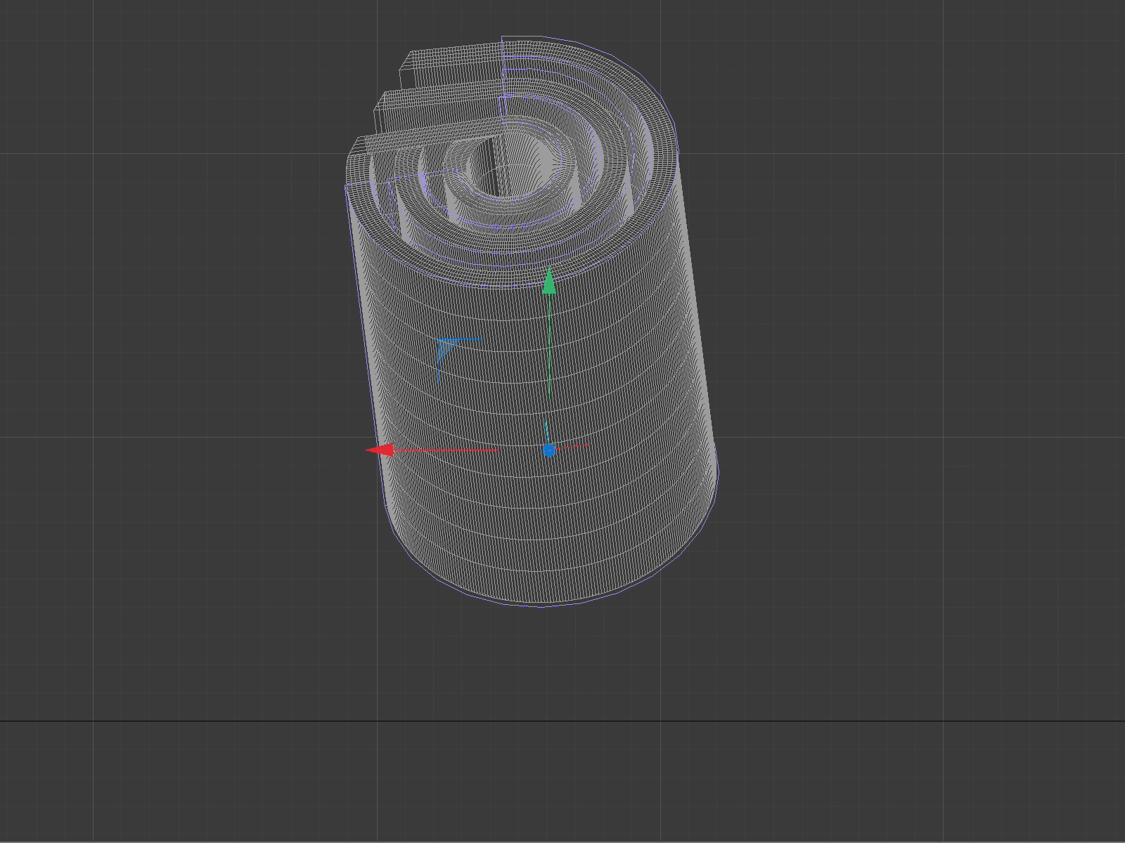
The logo is now a beautiful, simple rendition of the side view of a wad of cash, not a cowry or shell-like it once was. A wad of cash is something you can touch, feel, hold, and spend. Rolled up, it is a very casual, tangible, accessible looking thing, yet, in the Logomark the wad settles on its structured geometric side view. This is a great metaphor of how a structured, well-equipped company like Cowrywise is offering that structure to its audience in a way that feels accessible, casual, relatable, and tangible, without compromising on reliability.
More details about this case study at dadesign.studio
