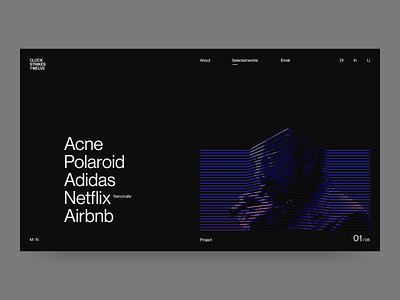
Clock Strikes Twelve portfolio
Sample designs from my new portfolio site
clockstrikestwelve.com
Taking influence from Swiss design, the site plays with generous white space, strong lines and bold Typography. The colour tones, combined with the pace and fluidity of motion, are intended to suggest a midnight inkiness, while the seismic lines on ‘Selected works’ represent an abstract clock face, striking Twelve.
More by Max Niblock View profile
Like

