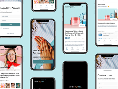
Neutrogena UI Concept
A few months ago I started to use Neutrogena products. Overall I'm very satisfied with all of them but especially with Hydro Boost Gel-Cream which is a product for skin. It "keep your skin looking supple and hydrated every day".
As a designer, I noticed an interesting font choice in their logotype, so I decided to improve it a little bit. I use Vultura, a new font I purchased a few days ago for one of my side projects.
Combined with a new color palette, over the weekend I tried to explore their user interface by converting web experience into an app. This is how it looks like. I hope you like it. ✌️
More by Ervin Halebic View profile
Like


