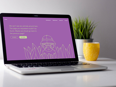
404 page
This is from the series of exercises I did as part of the Daily UI Challenge.
Design Hint: Does it suit the brand's style? Is it user-friendly? It might sound mundane, but not everything can be flash or glamorous. Every day millions of people will be landing on 404 pages. You have an opportunity to help them in a way that's useful and aesthetically pleasing.
My Solution: This was thought of as part of a website for a Safari company. I decided to have a very simple page, with an illustration as the main component. The message is more friendly than the usual “Error” and it gives the user two quick options, to go back to the previous page or to visit the Home page.
More by Veronica Silva View profile
Like
