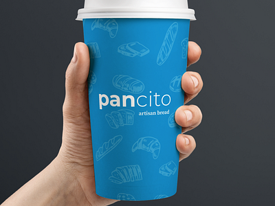
Pancito
Pancito is a Hispanic Bakery in New York City with a well-established clientele from all over Latin America. Their branding was very similar to other bakeries around the area, and since they were trying to expand their business, a new image was needed to stand out from their competition.
In Spanish, the ending “cito” means little, so Pancito means “little bread”. I wanted to play around with the meaning of it, and its visual representation. By changing the weight of the last letters, I created an optical equilibrium and accomplished to portray the definition as well.
One of the requirements was to use their existing blue as the main color, so to keep it simple I just added white. I also created a dark version of the design that could be used for special occasions or as an alternative to the main colors.
