Investment Mobile App


💌 Have a project idea? We are available for new projectsinfo@ronasit.com | Telegram | WhatsApp | Facebook | Linkedin | Website
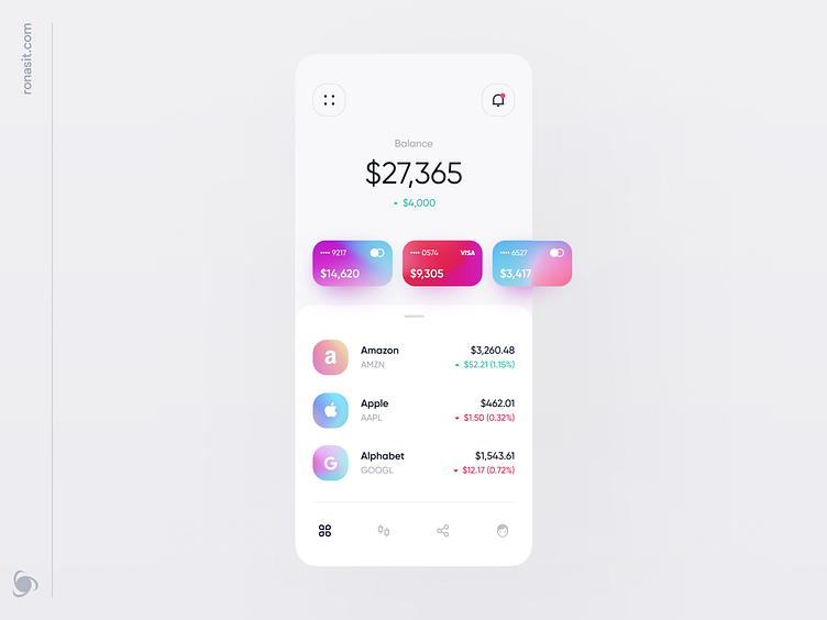
Until recently investing was a complicated process. Today we can manage it with a couple of taps on our phones. We've tried to make the process even simpler in our new minimalistic design concept for an investment app.
The first screen on this shot is Home, where users can see their available balance, a carousel with linked bank cards (they are shortcuts for quick balance replenishment), and a list of purchased stocks. The second screen features the most import information about a chosen company's stock with historical price data.
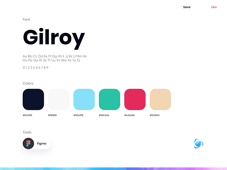
The UI color palette is calm with accents on interactive elements. To set the mood for the app, the accents were designed with bold and trendy Mesh Gradients. Because of their dynamic look, they add a funky vibe without being visually overwhelming.
What apps do you use to manage your investments? Are you satisfied with their UI?
💌 Have a project idea? We are available for new projectsinfo@ronasit.com | Telegram | WhatsApp | Facebook | Linkedin | Website
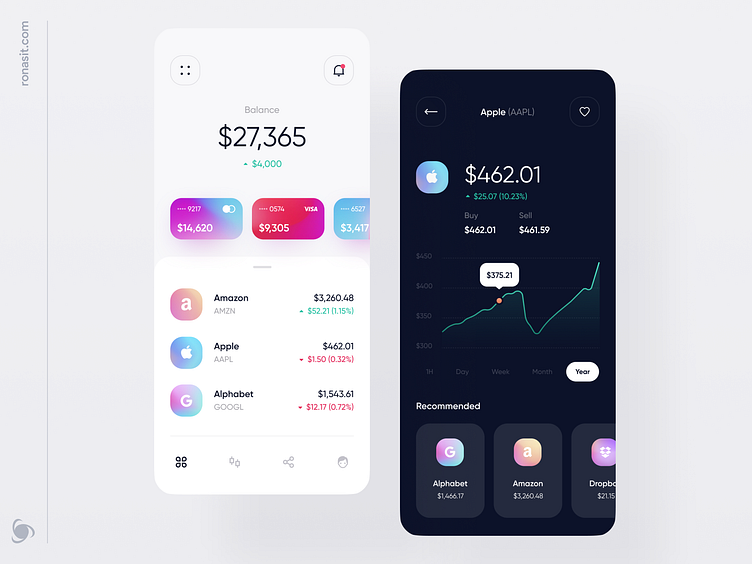
Until recently investing was a complicated process. Today we can manage it with a couple of taps on our phones. We've tried to make the process even simpler in our new minimalistic design concept for an investment app.
The first screen on this shot is Home, where users can see their available balance, a carousel with linked bank cards (they are shortcuts for quick balance replenishment), and a list of purchased stocks. The second screen features the most import information about a chosen company's stock with historical price data.
The UI color palette is calm with accents on interactive elements. To set the mood for the app, the accents were designed with bold and trendy Mesh Gradients. Because of their dynamic look, they add a funky vibe without being visually overwhelming.
What apps do you use to manage your investments? Are you satisfied with their UI?
💌 Have a project idea? We are available for new projectsinfo@ronasit.com | Telegram | WhatsApp | Facebook | Linkedin | Website
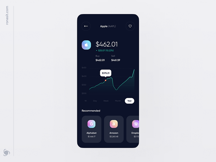
Until recently investing was a complicated process. Today we can manage it with a couple of taps on our phones. We've tried to make the process even simpler in our new minimalistic design concept for an investment app.
The first screen on this shot is Home, where users can see their available balance, a carousel with linked bank cards (they are shortcuts for quick balance replenishment), and a list of purchased stocks. The second screen features the most import information about a chosen company's stock with historical price data.
The UI color palette is calm with accents on interactive elements. To set the mood for the app, the accents were designed with bold and trendy Mesh Gradients. Because of their dynamic look, they add a funky vibe without being visually overwhelming.
What apps do you use to manage your investments? Are you satisfied with their UI?
💌 Have a project idea? We are available for new projectsinfo@ronasit.com | Telegram | WhatsApp | Facebook | Linkedin | Website
Until recently investing was a complicated process. Today we can manage it with a couple of taps on our phones. We've tried to make the process even simpler in our new minimalistic design concept for an investment app.
The first screen on this shot is Home, where users can see their available balance, a carousel with linked bank cards (they are shortcuts for quick balance replenishment), and a list of purchased stocks. The second screen features the most import information about a chosen company's stock with historical price data.
The UI color palette is calm with accents on interactive elements. To set the mood for the app, the accents were designed with bold and trendy Mesh Gradients. Because of their dynamic look, they add a funky vibe without being visually overwhelming.
What apps do you use to manage your investments? Are you satisfied with their UI?