Mobile Banking App
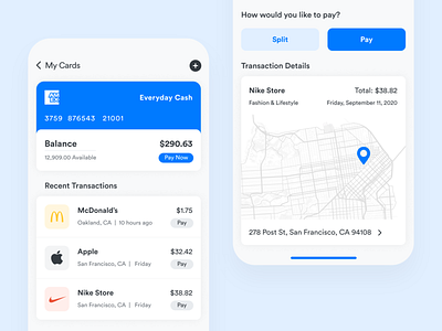
Here is a quick fix for the AMEX banking/credit card app, I thought it needed some cleaning, better hierarchy, information grouping and in general better UX/UI.
So I decided to redesign the 2 most important screens 1) Transactions and 2) Payments.
Above is the quick solution I came up with. Please let me know what you guys think. Thanks!
More by Rishad A. View profile
Like
