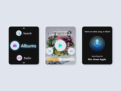
Apple WatchOS Music App Concept
Hey Dribbblers!
Here's a quick music app concept for Apple Watch! Because of the small and limited amount of screen space available on smartwatches, this was an exercise in trimming away a lot of the fluff that comes with traditional smartphone and computer apps. This was the first time that I attempted to design something outside of a smartphone/computer, so any feedback would be appreciated!
On the left is the main navigation, which features a vertical scrolling menu with distinct icons and a glow that indicates the currently selected item. This type of layout also facilitates future modifications as items can be added or subtracted.
The center image showcases the song screen, with basic play/forward/back buttons featured in the center. Album art is placed in the background with a dark filter to increase the contrast for text and interactive buttons, and neumorphic shadow techniques were implemented to give a slight sense of elevation.
The right image features the search function, which follows a similar layout as other established designs. Unlike most other designs, however, I wanted to include a text readout of what the app hears, which gives real-time feedback to users as to how the app is translating the voice input.
What do you guys think of it? Let me know in the comments below, and if you liked it, be sure to hit that "L"!
Want to collaborate or hire me? Contact me at theo.oing@gmail.com!
