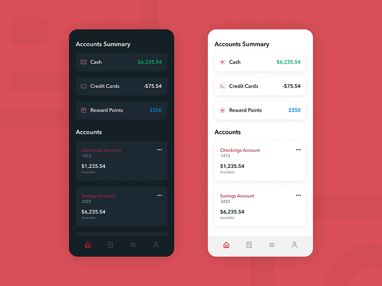
30 Min Wells Fargo Redesign
In an effort to push myself to iterate and ideate faster, I am going to start doing 30 min design challenges (ok sometimes they are 45 min like today). This will make for some imperfect posts, but I hope it generates good conversation. So let me know what you think!
For my first one, I redesigned the home page for Wells Fargo. Pulling some ideas from Mint, I wanted to provide the user with an account overview. Personally, I would love to see a brief overview of my cash flow and credit card spending every time I login to Wells Fargo.
More by Blake Hunter View profile
Like
