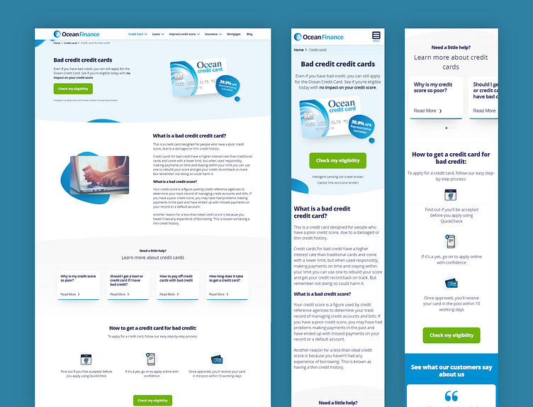
Ocean Bad credit product page
The original Bad credit Credit card page was too cluttered and had no clear heirarchy. This lead to confusion and complication for the user when it came to finding relevent information. The CTA being overshadowed by content and imagery for mobile users also negatively affected click through rates to the form, meaning the page had very little to no impact.....
More by Yot View profile
Like
