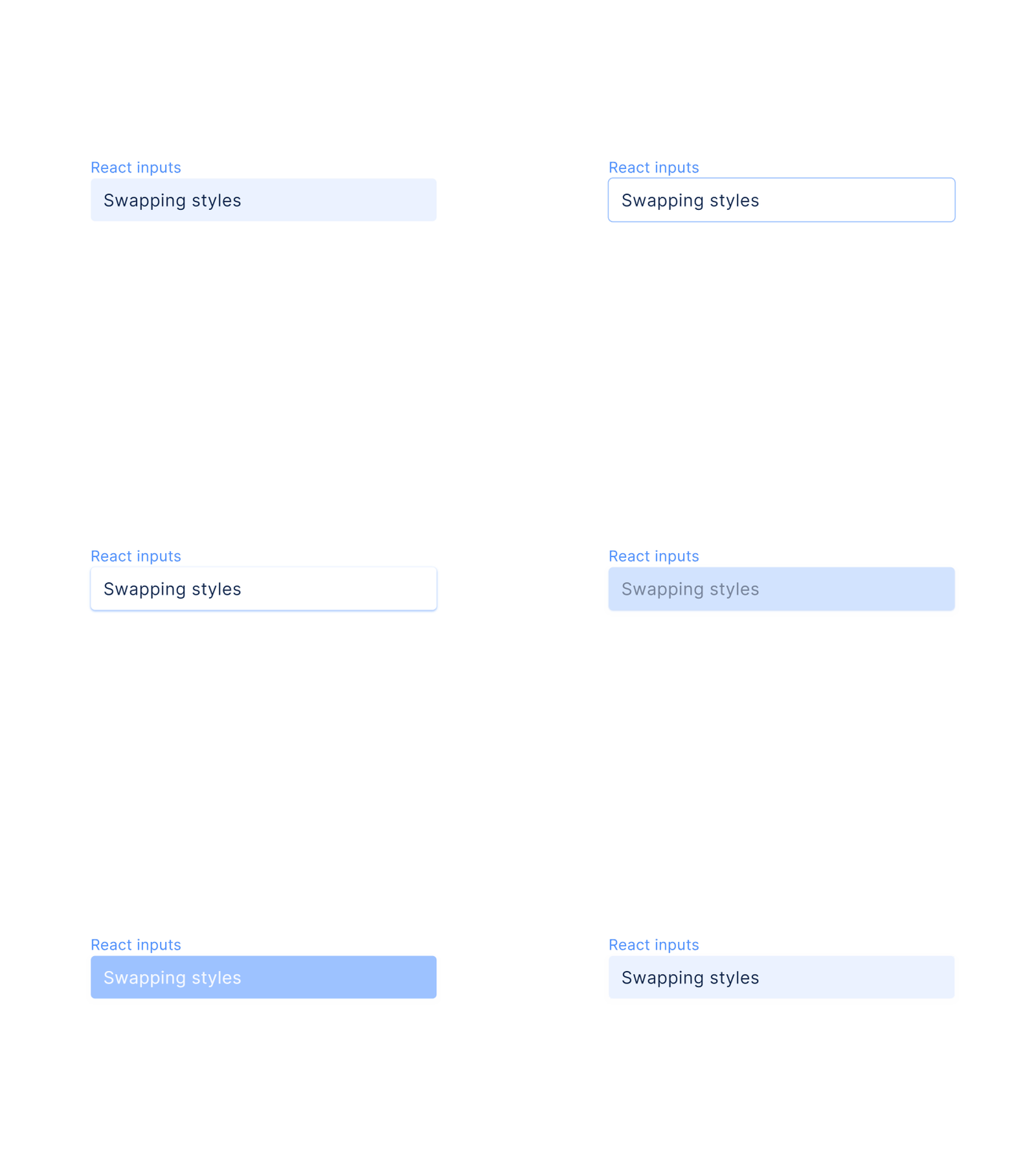
Figma UI kit React components — Input styles
React UI kit designed in Figma
2-in-1 toolkit for design & development. We carefully translated styles and specs from Figma into the React framework to fit with each pixel
20+ categories of most frequent components powered by Figma's auto-layout. Every UI item comes with Active, Onhovered, Clicked and Disabled styles (if usable). Each component is available in two sizes. Dense variants are included for high-density software interfaces. Fits for a variety of dashboards and web products.
Use UI kit to save time and design resources 🏃♂️💨
Setproduct Design System 2.0 - UI kit (Community).fig
70 MB
More by Setproduct View profile
Like
