Website redesign 2020
Looking for feedback on the layout at the top with the tags on the left and the paragraphs on the right. To me the "Filed under" heading makes everything feel unbalanced. Could push it further to the left.
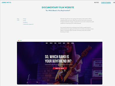
I've been rethinking my personal website recently. I generally like the design but feel it needs a bit of a refresh. I've been experimenting with various typefaces and still feel happy with the look and feeling that Woodford Bourne conveys, though I'm thinking of dropping the sans-serif I was using for headers.
This uses a 12 column grid, the font-size is a lot smaller, generally I've just added more spacing around everything and reduced the font sizes to give everything a more minimal look.