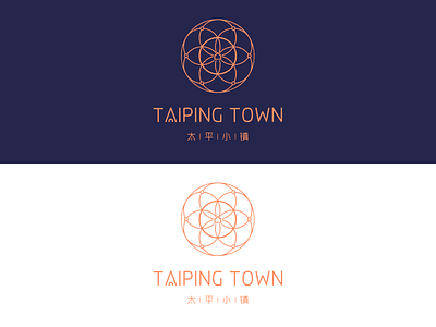
Logo for a retirement community
INTRODUCTION
This is a logo for a high-end retirement community.
The Town gets everything you need in the area - the house you live in, hospitals, shopping malls, central gardens, libraries, restaurants, gyms, galleries... etc. It's a full-service nursing community.
OBJECTIVE
The main objective was to create a visual identity combining traditional and modern styles, which conveys the concept of community where people get together and connection among them, as a family does.
OUTCOME
Following the concept of community and connection, the logo was based on the shape of a circle, which also is a typical shape in Chinese traditional culture, representing "reunion", "bond" and "perfect".
Six circles, which resembles 6 main industries of the brand, forming up a flower-like shape, conveys the meaning of happiness.
The choice of rounded sans-serif, along with the blue and orange colors, giving it the vibes of positiveness and high-end.
See the full case study at Behance:
https://www.behance.net/gallery/105970473/Retirement-Community-Visual-Identity-Concept-Desifn
