Craig Proper
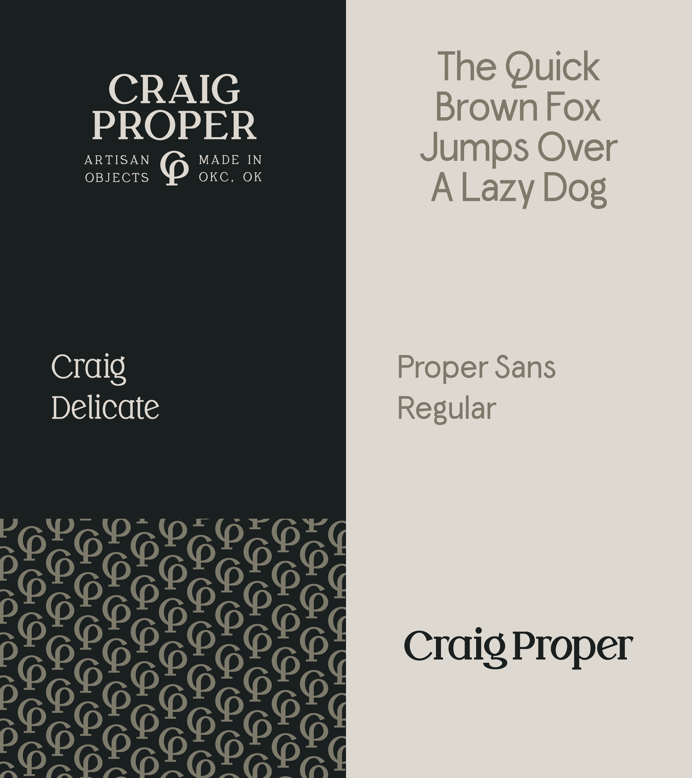
Over the past year, we've been helping Craig Proper redefine their brand at Half Design. We created three custom typefaces, and a mark that is both an evolution of the CP monogram, and a tree—representing Craig Proper's commitment to a more sustainable world. The CP pattern makes the tree especially evident as it comes alive in a row of trees.
More by Nate Ward View profile
Like
