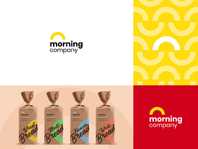
Morning company: Branding
One of our recent projects with the morning company. We took a minimal concept symbol but blended it with a perfect typeface to enhance the branding message and clarify what the business is all about. The Glaze Red and Bright yellow give a perfect contrast and feel.
.
Hope you enjoy it!
.
What do you think of this concept?
Feel free to comment down!
.
.
Follow us on Behance | Instagram
.
We're available for new projects,
Visit: hyfenstudio.com
More by Salt Design Studio View profile
Like

