Centr App Branding
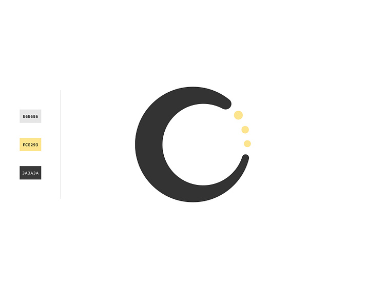
This logo concept relies heavily on the idea of balance and equal distribution. The circular mark helps the logo to feel centered - but by opening up the outer edge it is able to feel lighter. Adding in the three circles tricks your eye into creating a full circle with the C shape. I chose to use 3 circles to tie back into the 3 pillars of Centr. Leaving them floating creates a feeling of balance within the mark.
SEE MORE: https://www.designedbykels.com/centr-app
