MacOS Big Sur icons redesign
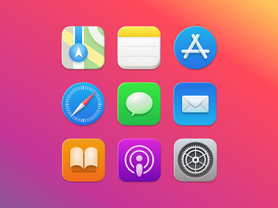
The concept project aimed to create an alternative version to the currently first seen images of MacOS Big Sur icons, keeping the main changes detected as a basis for the briefing.
Design details studied the following ideas:
- Universal icons for MacOS and iOS, inheriting shapes from both.
- Semi-Skeumorphism. Back to the realism feeling visuals through shadows and sensation of volume.
- Flat icons legacy. Currently proposed icons appearance seems to keep part of their iOS previous minimalism and economy of colors, details and textures.
Proposed changes were focused on the points above and included:
- Reduction of contrast, specially in shadows and shines, which appear to be out of place from the well-known elegant and relaxed previous designs.
- Color reflexions softened and reduced, with similar purpose as the previous point.
- Inclusion of glass/transparent nostalgia as a resource for adding volume.
- General ideas applied to all icons to keep styling coherence. e.g. if Chat icon includes 2.5D elements, so it does Podcasts.
By the way, on the top of the envelope it says: "Redesigned by RaulVazz in Barcelona".
Made with Figma.
If you have read until here, thank you for your attention.