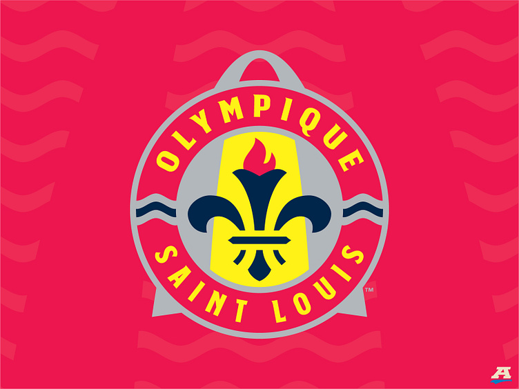
Project O = Olympique Saint Louis
While the actual Games were a bit of a mess, St. Louis is still America's first Olympic city, and that unique designation connects well with European soccer naming conventions; doubly given the area's significant French heritage.
To convey "olympic" visually, I merged the famed Olympic Torch into a stylized version of the same fleur on St. Louis' award-winning flag.
While red and navy are dominant in St. Louis sports culture (I increased the contrast with a brighter red and a darker navy), the Olympics' gold, silver and bronze medals' colors play a prominent role here since it was the 1904 St. Louis Games that first introduced the winners' medals.
This concept also attempts to incorporate numerous iconic elements associated with St. Louis, including:
- the same river design featured on the flag, split into two to represent the Mississippi and Missouri Rivers
- the almost-required Gateway Arch, creating a unique crest shape as it towers about the roundel, similar to the Arch towering over every downtown building and the entire region
- the stylized vertical stripes inside the roundel honoring past professional teams that called the St. Louis community "home"
- the actual red roundel, doubling as the O for "Olympique"
- not pictured (in secondary logos): a rod-iron "STL" mark utilizing the same torch design for the T
Again, this is a concept, but one I have been thinking about for more than five years, with hundreds of tweaks along the way as I learned from many talented designers on Dribbble.
While it may not be perfect to everyone, I really like how this turned out. I hope you do as well. Enjoy.
