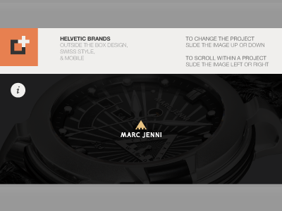
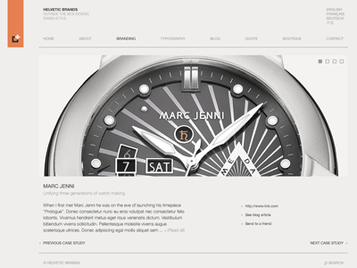
Mobile portfolio redesign
The current mobile version the portfolio (http://www.helveticbrands.ch/iphone) was created after the current site which made for somewhat of a disconnect between the two. Now while building the site, I decided it would be good to work on the mobile counterpart in parallel.
Should you want to test it out on your iPhone try http://www.helveticbrands.ch/uploads/mobile.png
I am thinking that after about 2-3 projects/images the instructions to the top right would disappear. Maybe a double tap for more information. Perhaps even a visual cue on the image but it might get cluttered.
Would love any comments and feedback.
More by Helvetic Brands® View profile
Like

