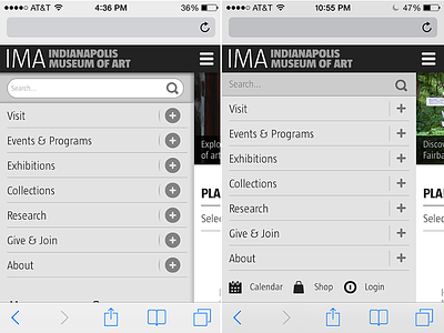
IMA Mobile Navigation Flattened
This is a screenshot (iPhone 4s) of the before (left) and after (right) mobile navigation for imamuseum.org. For a quick design update, we lost all of the drop shadow madness that was going on, and updated those clunky plus icons. There was a lot of wasted space in the search box in the old version as which helped to pull those bottom icons up a bit.
More by MSG317 View profile
Like
