UI 007 - Settings
Here is #007 of the UI Challenge.
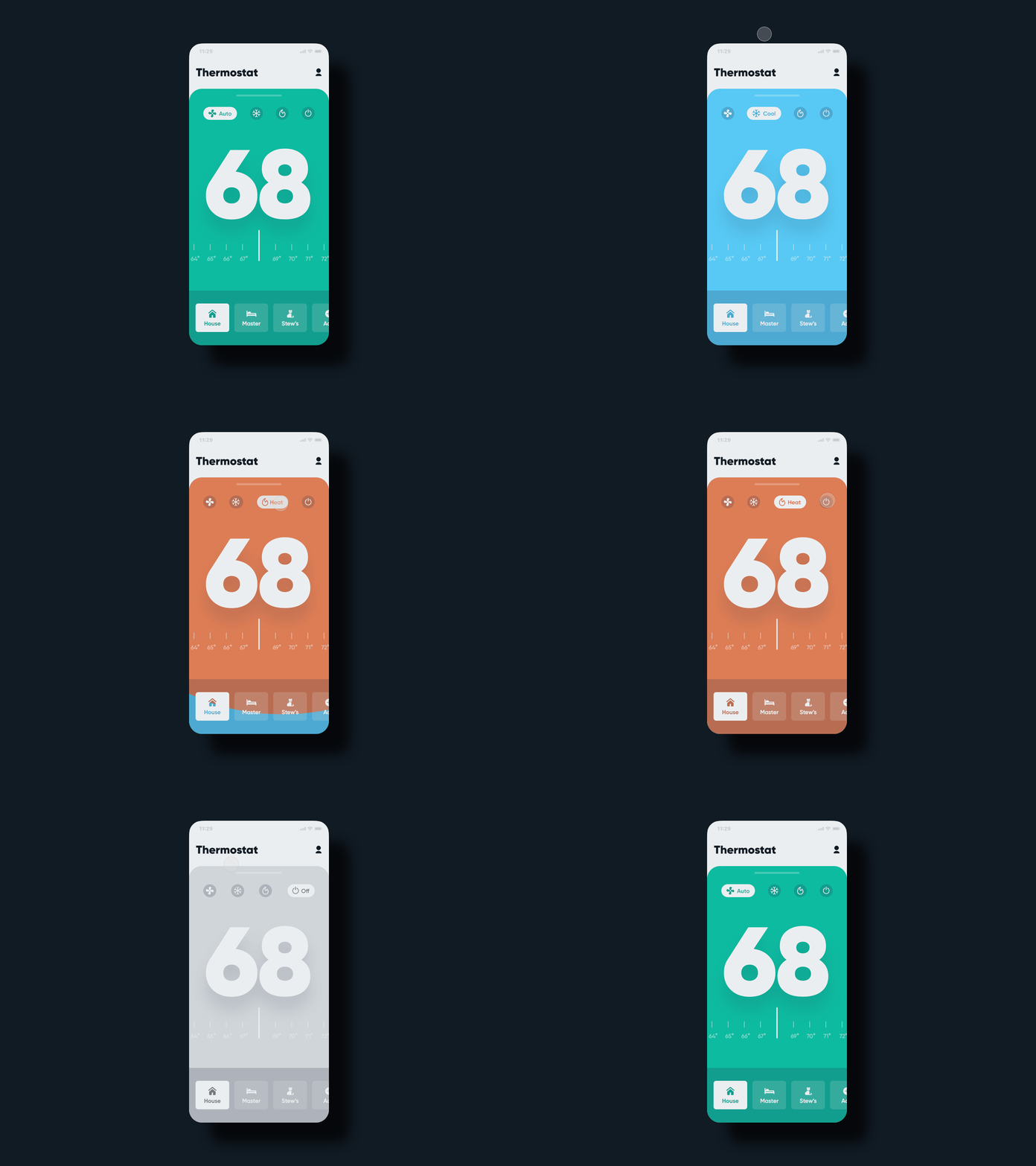
Really pleased with how this one turned out. I’ve been thinking about purchasing a new thermostat unit and decided to take a shot at designing the UX and UI for one.
I started off with just a static design but wanted to give it more life and character. The design was created in @Figma and animate in @Principle. I’ve never used Principle before so this was a great learning experience for me in regards to how much of an impact micro animations can have on a user's delight and enjoyment of a product.
A retro on a few things I could have included would be a scheduling feature to go along with the manual feature as shown in the design. I also would have loved to animate the horizontal scroll for the large temperature readout section, but as I said, I’m still learning and it’ll give me a task to practice for the future 😉.
Hope ya dig! 🤙🏻
Shout out to @mds for the slick Streamline 3.0 Icons, thanks bud!
