Contact details
Hello everyone 👋
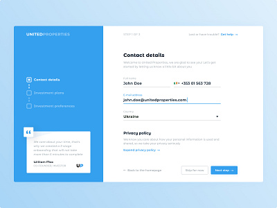
Here is a new user onboarding design concept for the real estate investing platform.
The fewer steps and actions the user needs to take to complete his task, the better. Therefore I've made onboarding as easy as possible by dividing the tasks into 3 steps and grouping them with only the most relevant information we need to know about the new customer.
I also think it is important to inform the user about how his information will be used. Especially it's vital in industries such as investments. By calling up to pay attention at Privacy policy, you informing and increasing the trust of your company.
What do you think of this? Share your thoughts, drop a ♥️ if you like it and stay tuned for more!
Got a cool project in mind or need help with existing?
Drop me a line at ntnkodesign@gmail.com | LinkedIn | Dribbble

