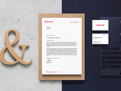
Rotstift Redesign Web Header
Rotstift's clear stationery is complemented with postcards and complement cards with statements and articles on spelling and microtypography. To start the communication in the new dress, a haptic, targeted distribution is also planned. In a witty way, attention is drawn to the tragedies of missing punctuation. Thus, Rotstift can again represent the agencies and institutions and once again arouse the desire for spelling.
More by SUAN Conceptual Design GmbH View profile
Like
