SUAN Rotstift Redesign Typography
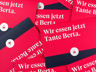
In logo design, the additional icons previously combined to form the red pencil give way to a very clear, minimal design language. The display font GT Super is made for red pencil and underscores in its function the digital as well as the well-known. The shade of red was refreshed and combined in the communication with two secondary colors - so we created by color and typography alone a corporate design, which helps the traditional company to a new appeal.
