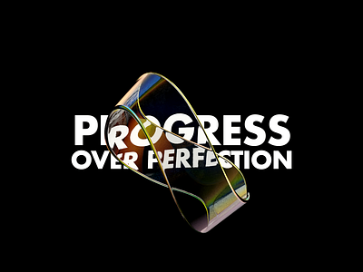
Progress Over Perfection
I got inspired by some gorgeous designs that I saw recently that mixes plain type with an abstract glass object above it giving the text cool looking distortions. So I challenged myself to see if I could reproduce something similar in Blender.
Turned out to not be as good as the references that I saw, but given my lack of skills at least is some progress and a well worth exercise.
I'd love to get some Blender tips to improve for the next one, so feel free to drop some knowledge :D
More by Nando Cordeiro View profile
Like
