Muksitul's Grocery App UX

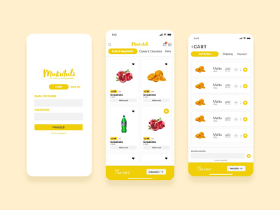
The Home page is divided in four sections. First section contains the logo and other tool buttons like search, cart and settings. Second section contains the category bar which is vertically scrollable and clickable. A user can swipe through the category to find the exact thing for them.
An extra option can be added called “All categories” if suggested which can contain a category view page with all categories there. I have changed the design a bit from the last demo and made it more user friendly. Also multiple tab systems made it easy for users to navigate through the app. This module can also be used for checkout progress bar without any additional design elements which speeds up the work by a bit.
In the third section, each individual product card contains a bold box with price lettered and previous price mentioned beside that. The card contains the name and also the measuring weight. (mg, kg, ml, lt, lbs, per piece). A user can favorite certain items and the app can automatically notify if one of those products goes for sale/ price reduction/ price change. Also the system can be configured in such a way to only send targeted notifications if any user has that product favorited.
For the fourth section I have decided to keep a fixed section to always easily jump in to quick checkout. It always views the total price for the cart selected and allows you to checkout easily with one click.
A user can search items from anywhere in the app. Tapping on the search icon toggles a search bar right under the category belt. Search results show as different pages and a user can reset it to go back to the home page. Also if a user chooses he can search through a specific category and the category name shows right beside the reset button without intruding on any vital elements.
The cart section will show all the different items a user has selected and it will also allow to increase or decrease the quantity. The total always shows below in the fourth section I explained earlier. It is to promote the versatility of a design and allow users to know that it is very easy to checkout and confirm the order from anywhere inside the app at any moment. Cart includes a coupon redemption section.
The cart window contains a progress bar with three checkpoints as followed: Cart Review, Shipping and Payment. User reviews the cart then enters their shipping information or chooses from a preset address by a user and completes the payment on the third checkpoint which will be any payment gateway. No additional page design is required for this particular feature.
Settings bar contains three items as followed: Personal Information, Shipping & Payment and Help. Users can update their personal information if the client wants their user to allow it. Users can save their bKash payment token as bKash merchant API allows to do so and also can allow users to save their payment cards if the payment provider allows it or the client is able to acquire proper authority.
Login page contains the credential input boxes and two tabs. One for logging in and one for sign up. If the client can list the items required for sign up, an additional page can be designed and provided.
Login page also allows a user to recover forgotten passwords.