Rebranding of Wings Educations - logo
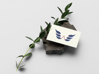
The logo's wings were carefully inclined at a certain angle but also make each wing look like a bird. This represents the brand's storytelling.
Check my full work of this rebranding on Behance and show some love
The logo's wings were carefully inclined at a certain angle but also make each wing look like a bird. This represents the brand's storytelling.
Check my full work of this rebranding on Behance and show some love
