Reminders - iOS App Design
Hey everyone 👋 , I lately started a reminder app design for iOS.
I kept an eye on human interface guidelines and used a modern layout grid to maintain consistency.
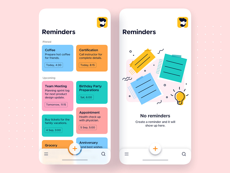
I started with the home state that has quick access to previously created reminders and a go-to option for creating new reminders.
I leveraged the bottom app bar from Material Design Language.
It tailors the flexible and quick reach to the primary actions justifying the Fitts Law, as a user doesn't need to travel to the extreme top to access primary actions.
In case if there are no reminders, a user is offered an empty state which helps the user to understand the purpose of the interface. I drew a minimal and bold illustration that provides a visual clue to the user.
Stay tuned for more updates on this!!
