Swippay | a young pay app
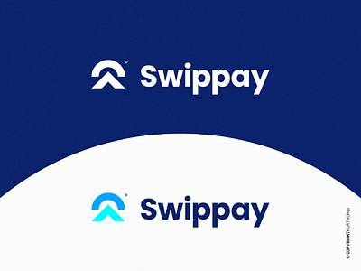
Swippay is a brand new generation of online payment applications. Easy and accessibility are the key words of the startup. It is intended for a young clientele, who are starting the complicated adult life. It allows to put in confidence, to reassure, and to help the users to manage their bank account. Swippay is inspired by the new word "Swipe" which means to slide. It is a new, young and above all very specific language for technology and digital. Then we have "Pay" which means to pay which is the principle of the app. Just with the name alone, the scene is set and we know that we are dealing with something focused on youth, digital (so smartphones) and an online payment application. Short and easy to remember, are two other qualities of this name. The whole logo is serious, with corporate colors and a simple pictogram. This pictogram has several meanings. The arrow represents the user's positive financial growth as well as the movement to pay (the swipe that consists of sliding up). The arch evokes the digital aspect and therefore the fact of paying from a distance. It is inspired by the symbol of Wifi. This arc also schematizes the top of the finger when we slide it on the screen. This pictogram represents firstly the fact of paying remotely and secondly, to perform the action of swipping upwards to trigger the payment. The typography is sober, the whole on a navy blue background to keep a softness that black does not have. The other two blues are more vivid and therefore contrast with the whole and show the liveliness, speed and freshness (and therefore youthfulness) of the application and the target clientele. ———————————————————— 🌐 My website : https://hurtikonn.wixsite.com/hurtikonngraphic ————————————————————
