Eenie Meenie Miney Mo
Playing around with a replacement for the dreadful white-label M-Ticket app.
The current app does one thing: ticketing. Despite its many users, consensus seem to be that it's pretty bad at it with a lot of cognitive overload in the ticket selection step and basically the every flow in the app is horribly complicated.
The white label nature of the app also means it's a completely alien experience to both Brighton & Hove Bus company and the platforms it runs on.
The company route color codes - used in the bus stops, buses themselves, aren't present anywhere in the app.
And the tab bar on iOS is used to trigger an action sheet instead of navigation (along with many, many other nasty things).
As such, it doesn't serve the company or its users as well as it should. Mobile is a pretty powerful channel and more could be done to expose the full range of services provided by the company, other than its main city bus service.
It's also not being used as a basic communication channel for service disruptions and contains an external dead link which appears to be an internal screen containing bus timetables.
Messy.
I've been doing research on interactions, users, company but today I decided to dedicate some time to make pretty pixels, or try to.
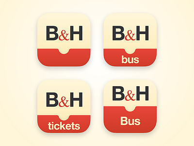
Started with the app icon. Top-left was the first iteration and doesn't scope itself to being a bus or ticketing app. Other iterations were just for exploring other possibilities but they're more complex and scope the app to just tickets or Bus which I'm not sure if it has any value.
Tried to respect their current brand, e.g.: the beige and red are prominently used in their buses.
I've attached a Home screen containing the top-left icon if you want to see how it feels on the device.
Feedback welcome! (also: it kinda reminds me of the Campbell Soup label)

