Family Planning Elevated Business Cards
Family Planning Elevated (FPE) is the younger, albeit bigger, sibling of the HER Salt Lake Contraceptive Initiative. From 2016 to 2017, HER Salt Lake provided 7,402 individuals in Salt Lake County with free contraceptives. Through this introductory initiative, one thing became very clear– there is a significant contraceptive coverage gap in Utah, and a sustainable, statewide solution was necessary. With HER Salt Lake’s successes and lessons learned in mind, we created the Family Planning Elevated brand identity.
FPE strives to increase access to contraceptive services and resources for marginalized individuals seeking contraceptive care, with a commitment to mitigating financial, geographic and informational barriers. Since FPE was progressive in its approach, we wanted to create a brand that was visually dynamic and would resonate with a broad range of audiences.
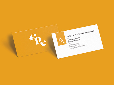
Our objective was to create a compelling brand that would be relatable to all individuals as well as healthcare providers. We've established a visual identity that could be instantly recognizable as a modern, professional logomark. The custom designed typeface makes this logo unique and friendly. It incorporates a bold, graphic version of the Caslon typeface, with thin lines connecting between letterforms to emulate steps leading upward. As an additional visual element, we imposed the logo on a gold background to illustrate a radiant disposition. This representation signifies elevating the individual and establishes a persona of self-empowerment. It establishes an identity that resonates with their target audience.
